


Minglo is an iOS super app designed to support users in both their daily lives and careers. It integrates multiple services into a single app, including a Wellbeing module for mood tracking and mental health management, and a Career Support module that helps users explore job opportunities through recommendations powered by an AI agent.
The app primarily targets users in Southeast Asia, including Vietnam, with plans for future global expansion. The Career Support module specifically focuses on engineering roles in the IT industry.
Super app: A mobile app that integrates multiple services and features (modules) within a single application.
TEAM
1 PO,1 PM, 1 PMO, 2 UX/UI Designer2 (including me), 3 Engineers
TOOLS USED
Figma、Figjam、Nota、Slack
DURATION
JUL2023 - JUL 2024(1 year 1 month)
TAGS
B2C 、iOS App
I worked remotely on the UI design of Minglo, a project commissioned by Atrae, Inc. Most of the project team was based in Vietnam, and English was the primary language used for collaboration.
I joined the project after the product concept and functional requirements had already been defined. Working within the established components and visual guidelines, I designed UI for multiple wellbeing and career support features in Figma. After the designs were approved, I documented interaction behavior, screen transitions, and other UI specifications in English and provided them to engineers through screen specifications in Nota.
The app supports both English and Vietnamese. The UI was designed in English first and then translated into Vietnamese by another team member.
Created wireframes and UI mockups based on the requirements for assigned features
Designed interfaces using established UI components and design guidelines
Documented screen transitions, button behaviour, and other UI specifications in English using Nota and shared them with engineers
Selected screens are shown below.
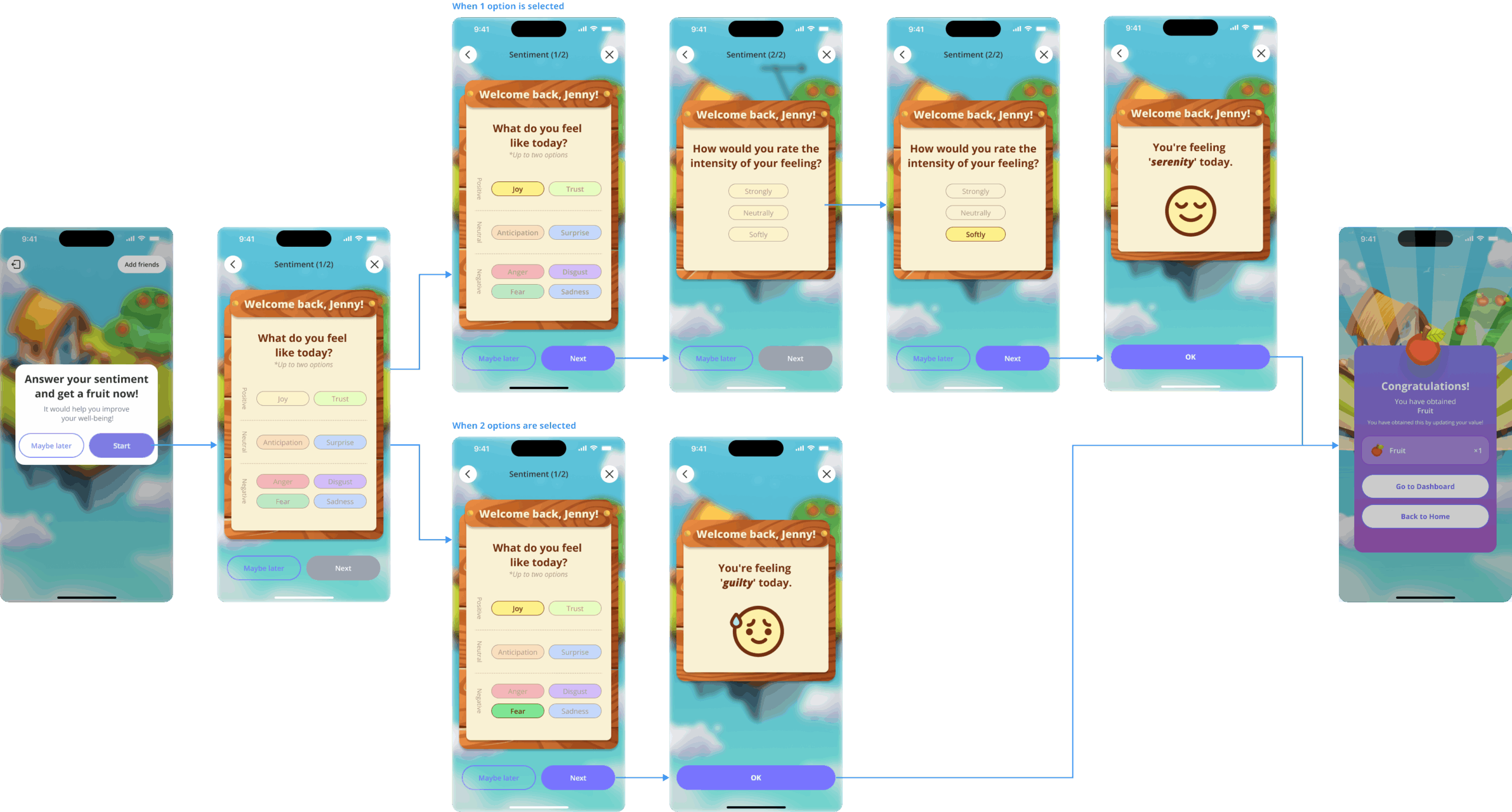
Overview:
When users enter the Wellbeing module, they are presented with a daily emotion check-in. To help users identify and select their emotions intuitively, I used visual elements such as colors and icons, drawing on Plutchik’s Wheel of Emotions and related research as references.
Design Considerations:
I kept the interaction flow simple to make daily check-ins easy to complete and maintain over time. While staying consistent with the existing brand direction, I aimed to create an approachable and engaging experience that balances visual appeal with usability.
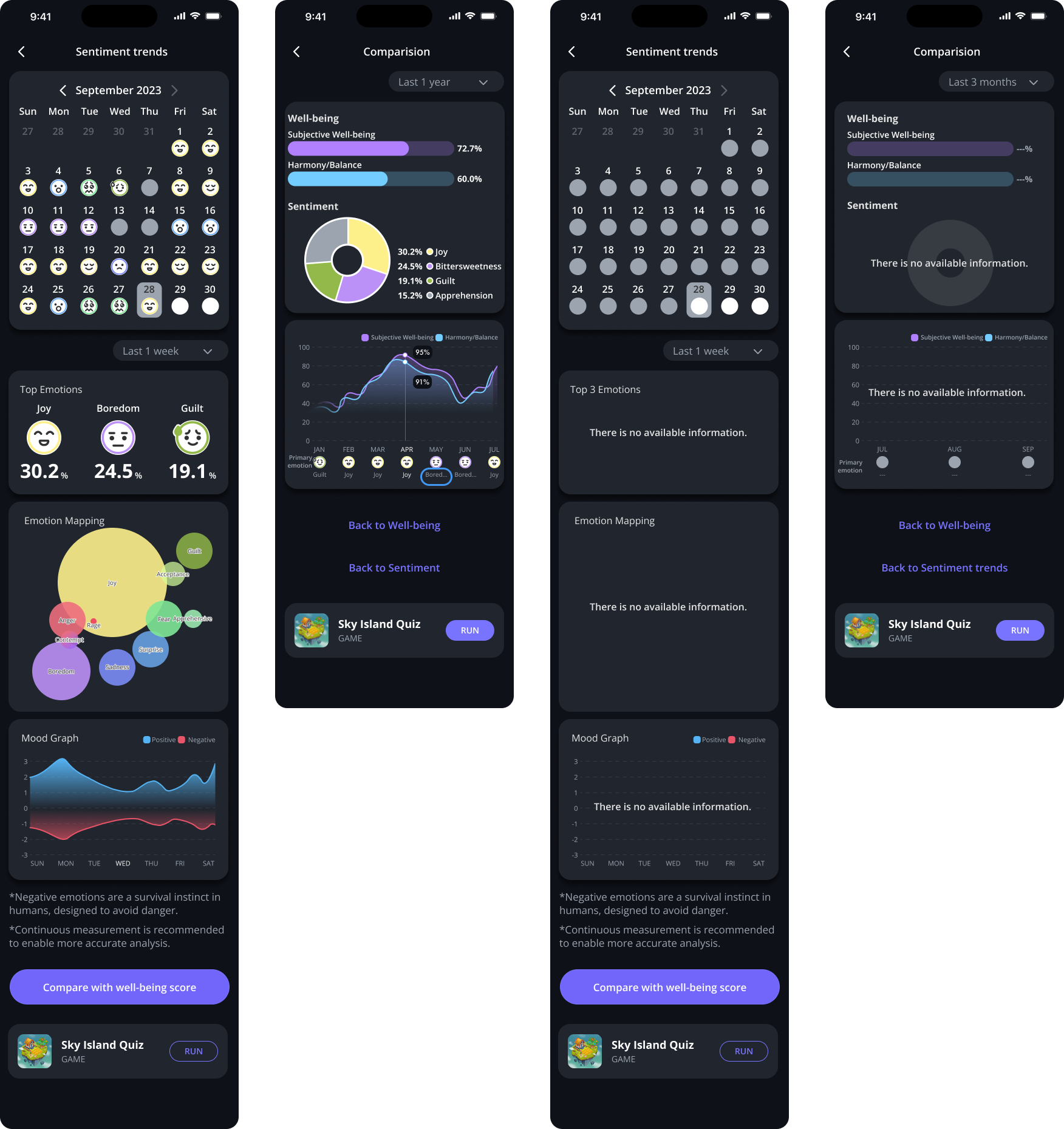
Overview:
As users accumulate daily emotion records, the app visualizes changes in their scores and sentiment trends over time, allowing them to reflect on changes in their emotional patterns.
Design Considerations:
To avoid overwhelming users with information, I used graphs, charts, and icons to make changes in scores and trends easier to understand at a glance. I also organized the information hierarchy to make key metrics more prominent and easier to scan. The Emotion Mapping visualization was inspired by Plutchik’s Wheel of Emotions.

Overview:
This onboarding experience introduces users to the Wellbeing module when they access it for the first time. The existing screens had already been designed, so my responsibility focused specifically on designing the tutorial experience.
Design Considerations:
The original tutorial consisted of multiple steps. To reduce development effort and minimize potential drop-off, I streamlined the flow by focusing on essential information and reducing the number of steps. I used concise, easy-to-understand copy and a straightforward screen flow to help users understand the feature with minimal effort.
Overview:
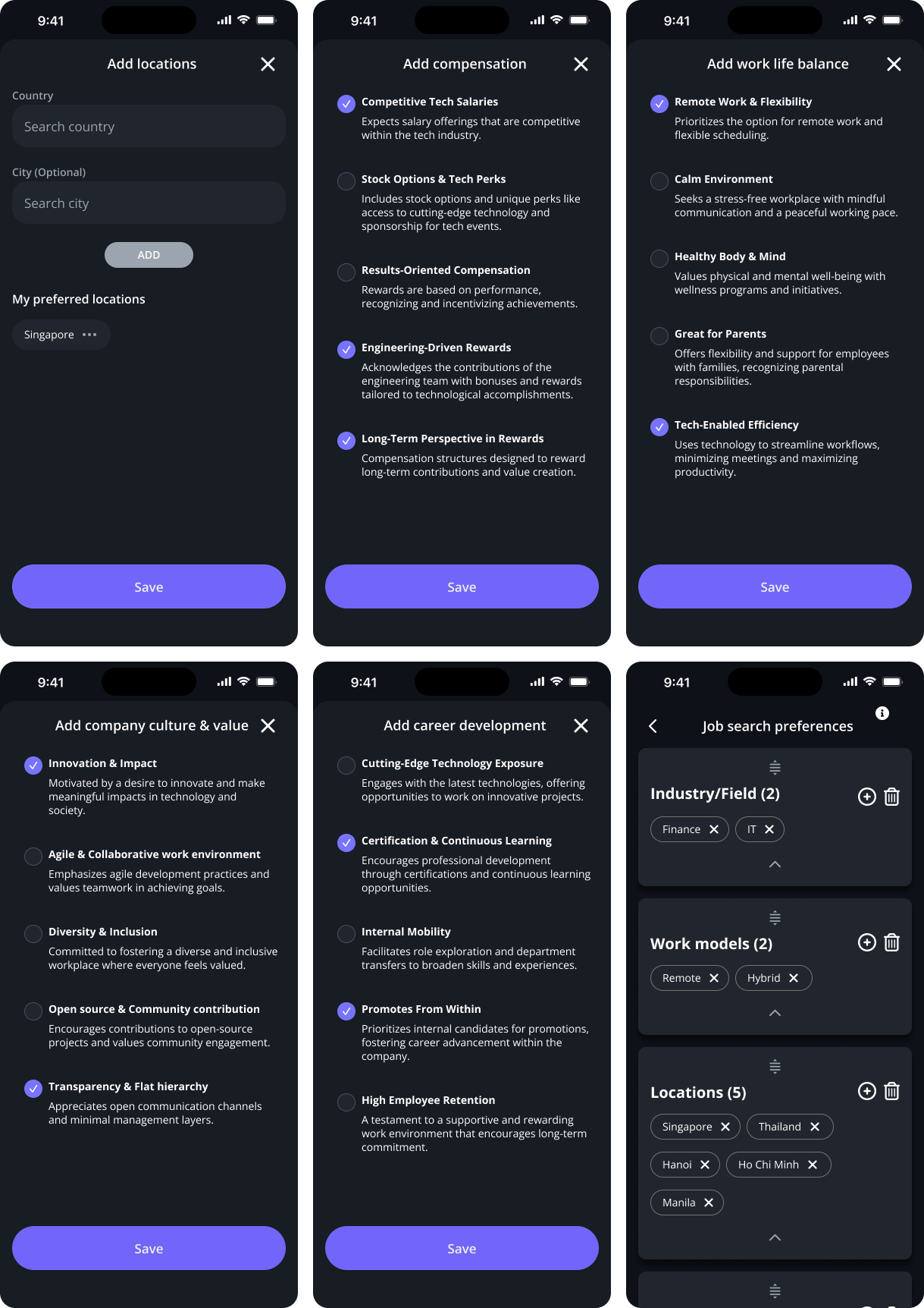
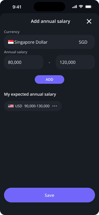
I designed the flow for users to set their job preferences, including desired roles, locations, and salary, within the Career Support module.
Design Considerations:
With a multinational user base in mind, I considered differences in values and employment conditions across countries and regions when defining the fields and input formats. For preference-related fields that could be influenced by cultural differences, I conducted research and gathered feedback from multinational team members to refine the content.
Overview:
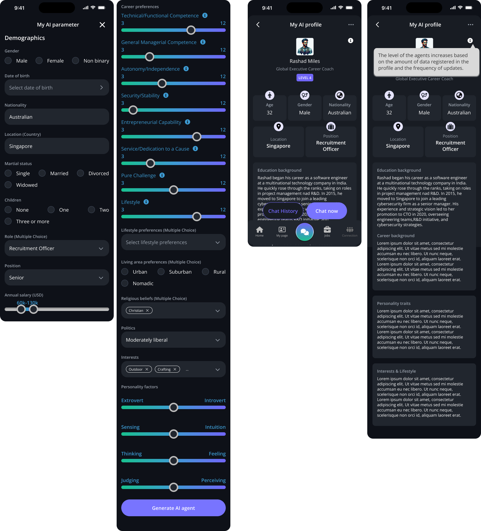
I designed the setup flow that allows users to personalize an AI career advisor, as well as the resulting advisor profile based on their selections. Once the setup is complete, users can consult their personalized AI career advisor through a chat-based experience.
Design Considerations:
Because the setup involved many fields, I primarily used selection-based UI patterns to reduce input effort. When translating high-level requirements into specific settings, I researched established frameworks such as Career Anchors and MBTI to help define the categories and options.
For the personality settings, rather than limiting users to binary choices such as Extrovert or Introvert, I introduced sliders that allow users to express where they fall between the two ends of each spectrum. I also provided contextual guidance for options that might require clarification, helping users understand their choices and complete the setup smoothly.
One of the challenges I experienced in this project was translating text-based requirements into the experience that the PO and PM had in mind. To align on the direction as early as possible, I created and shared multiple low-fidelity wireframe options before moving into detailed UI design. This helped reduce misalignment and made communication and iteration more efficient.
In some cases, the requirements defined only the high-level sections, leaving the specific content and interactions to be explored through design. I learned to research relevant frameworks and existing patterns, translate abstract requirements into concrete options and interactions, and validate the direction with the team early in the process.
Through this experience, I learned the importance of visualizing ideas early, clarifying ambiguous requirements, and using research to support design decisions rather than moving directly from requirements to polished UI.