Rotten Tomatoes provides review aggregations for film and television. The website has two aggregation scores from critics and Rotten Tomatoes users(audience). In this redesign challenge, I revamped the website for desktop, including typography, iconography, layout and touchpoints while I keep its branding.
Date
SEP 2022
Plateform
WEbsite for desktop
skill
ui design
tools
FIGMA, ILLUSTRATOR
Problem Analysis
Presuming the goal of the Rotten Tomatoes, they would like to (1)enlarge the number of their fans and (2) gain more customers to apply for the paid programs. In order to do that, the website could improve:
Make visitors visually excited through the website.
Prioritize what information the visitors look for.
Solutions
Home Page
Original
Redesign
The header is gotten simplified to make the user's purpose, in this case, they can focus more on searching by keywords or clicking the menu. Under the header, I made it clear which article users should focus on. There was too much information in the small space.
It was not a consistent way to show the ranking in the TV shows and movie sections. There were many different rankings here and looked just listed them. I focus on 5 general rankings and 1 customized ranking with the same ways to display, which look visually exciting. If it kept 8 rankings, the audience could be bored. Additionally, both ratings from critics and audiences are shown since only the critic rating was visible on the homepage.
The looking was so unbalanced. There was non beautiful dead space under the biggest image. That is fixed and gets simple.
The footer colour is changed to keep their brand colour, which is the main colour, red. Furthermore, I change the newsletter parts to make the CTA button outstanding. They repeated, "join the newsletter " twice in the close spaces and that was changed to simple words due to more outstanding. It was moved up too to be more eye-catchy.
Single Page
Original
Redesign
<span data-metadata=""><span data-buffer="">I moved right down the ranking list on the top right side to make the main part have more space. Also, when the user scrolls down, there is always white space on the left. It is such a waste of space since this page includes many images and should be shown effectively.
<span data-metadata=""><span data-buffer="">The picture which represents the movie should be the main object and more outstanding.
<span data-metadata=""><span data-buffer="">With the redesigned version, the movie information should be easy to find at the first glance. I condensed the information under the trailer. Additionally, I changed the way to show the rating to use five stars/ gold tomatoes. The reason is that people are used to seeing this way because most reviews use it.
<span data-metadata=""><span data-buffer="">The sections about reviews were not organized well. The “add the review” part and actual reviews were separated. It could make users confused. All sections about reviews should be next to each other. Moreover, they did not show any audience reviews although there are enough amount reviews and the section existed. It looked like they don't have reviews or only a few. On the other hand, critic reviews had so much space. I made it tidy to be easy for users to look for.
<span data-metadata=""><span data-buffer="">In my opinion, the information about “News & interviews” could be not so vital for users. I moved it down, lower than the review sections. Also, the pictures on the News & interviews were vertical squeezed.
<span data-metadata=""><span data-buffer="">Across the page: The layout to show "headings" and "view all" parts should be better to keep consistent with the home page.
Colour Palette & Typography
Colour Palette
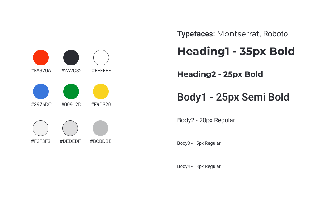
Basically, the same colour palette is applied to maintain its branding, which has already been established.
Typefaces
For headings, I chose Montserrat which looks modern and legible with comfortable spacing. The body typeface is similar to the original, which is Roboto.
Iconography
Icons
Most of the icons were used that are as similar as possible. They are simple and soft impressions with rounded shapes.
Rating Icons
Simplified the icons for rating although they are unique ones on Rotten Tomatoes. It helps the icons to be recognized easily. Also, I utilized limited colours based on the colour palette to create an overall cohesive look.